Visualizing people data in one place
Intro »Human resources is generally a salient cornerstone of any organization, but digitization has democratized a lot of the work that goes into HR, and that’s meant more people in businesses interested in, and using, the kind of data that HR people build and typically manage.
Company
ChartHop
Role
Product Design
Visual Design
Year
2020
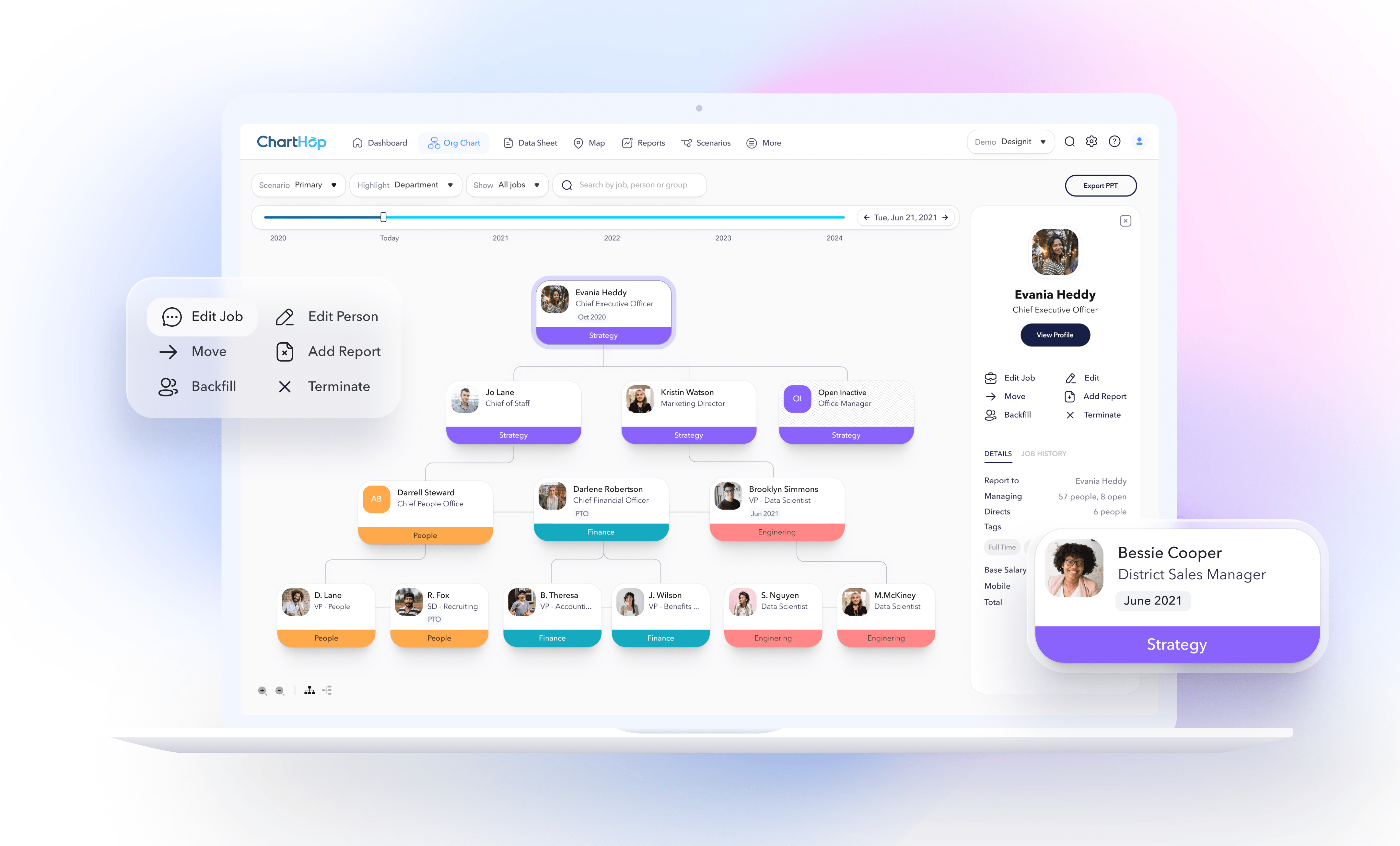
ChartHop supports leaders in scaling transparent, productive, and intentional organizations by centralizing all data and processes in one place. I lead the design, helping the ChartHop team make their digital product experience deliver on customer expectations.
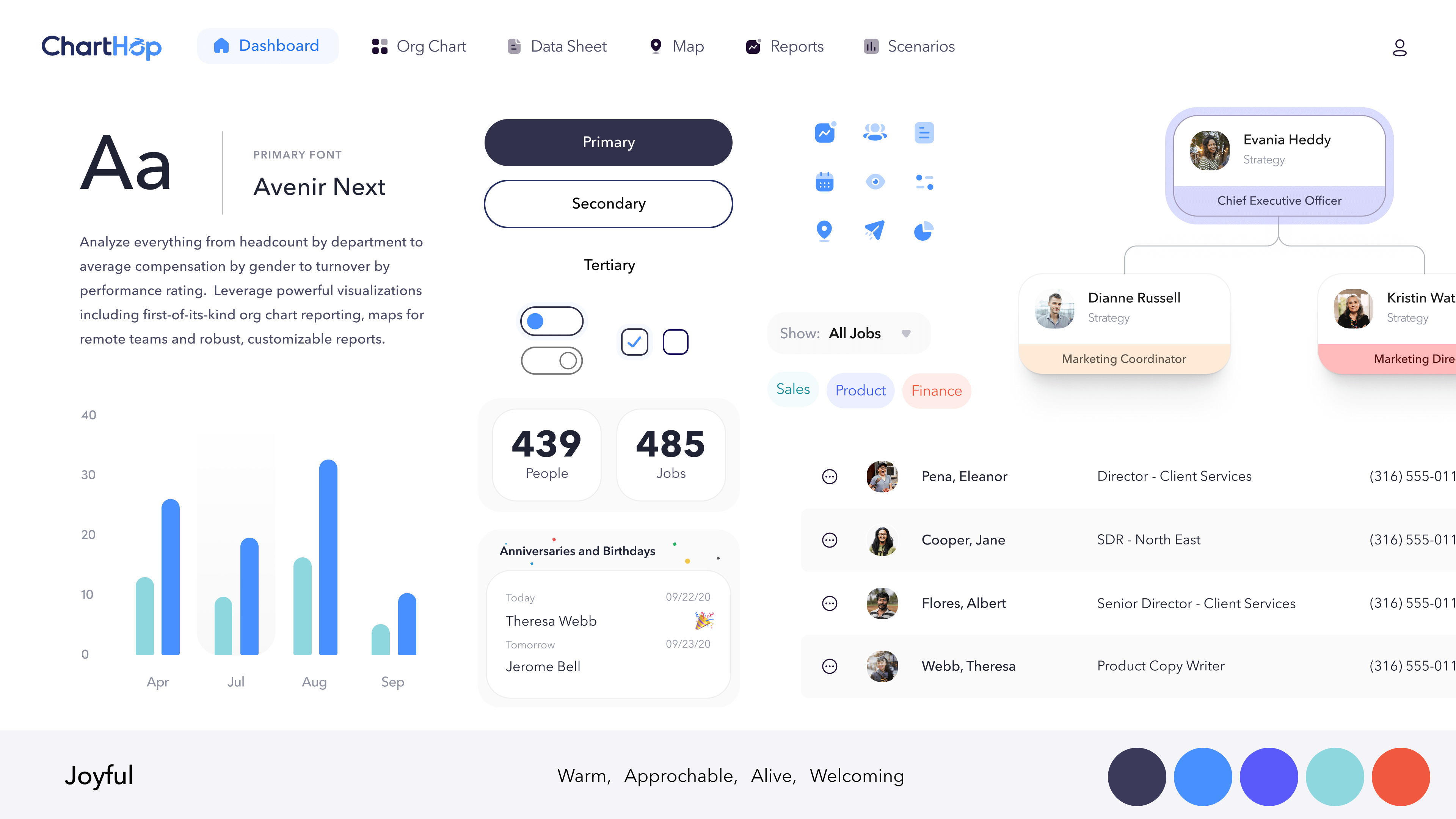
Style studies selected for the visual direction
Goals
Using a people-centered approach, I leveraged exploration, co-creation, and user validation to create alignment and excitement with employees and customers around the new visual language.
The overall goal of the project was to increase customer engagement, improve usability and secure consistent visuals and language, create a new and compelling visual language consistent with ChartHop’s brand experience attributes and provide a component library to enable the team to build out the product, and do rapid prototyping
Solution
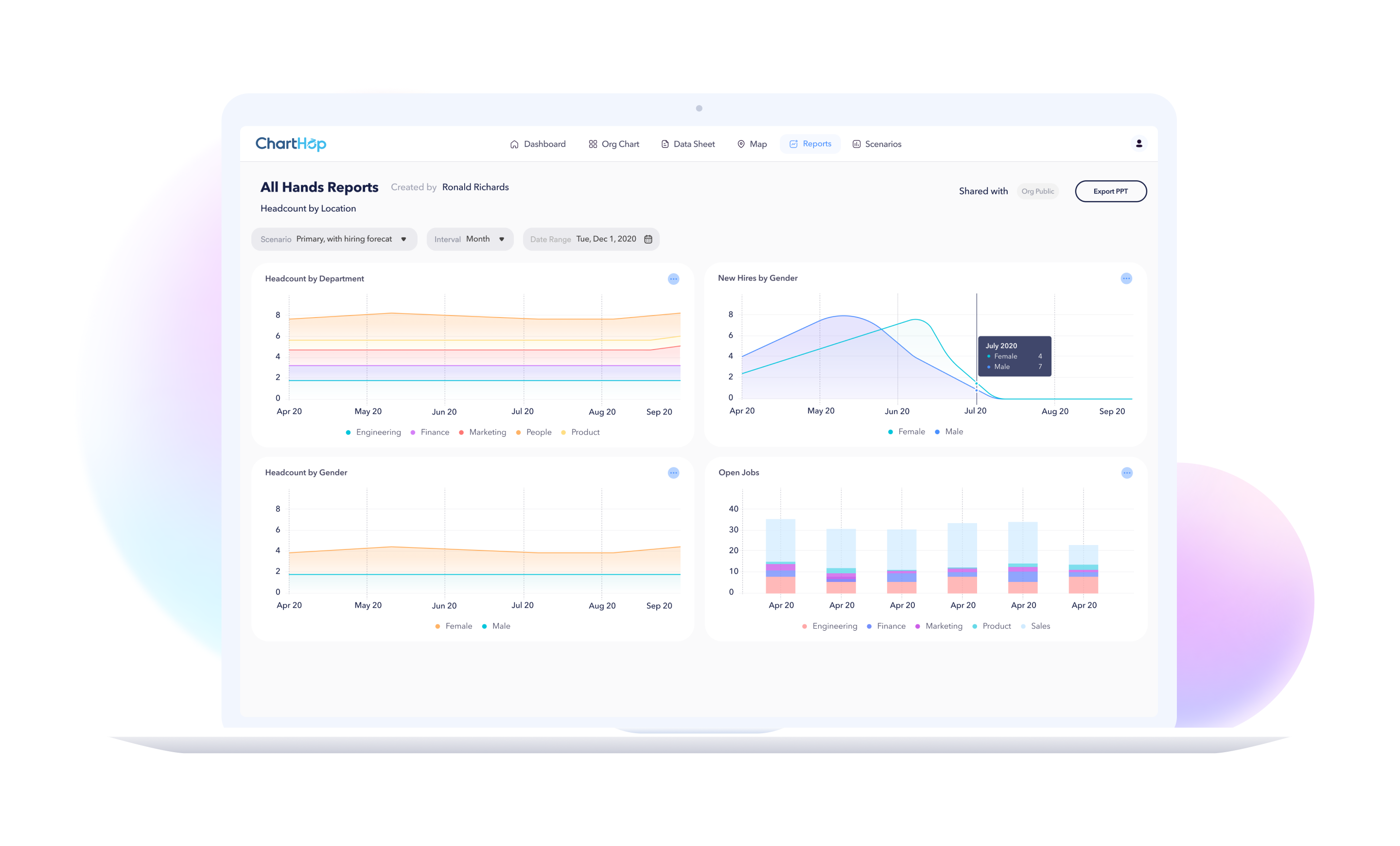
In close collaboration with the engineering and marketing team at ChartHop I created a new visual language for ChartHop’s web product that reflects their modern, friendly, approachable, people-first brand, and created an impactful digital design system that the UX team is now using as a foundation to evolve the product.
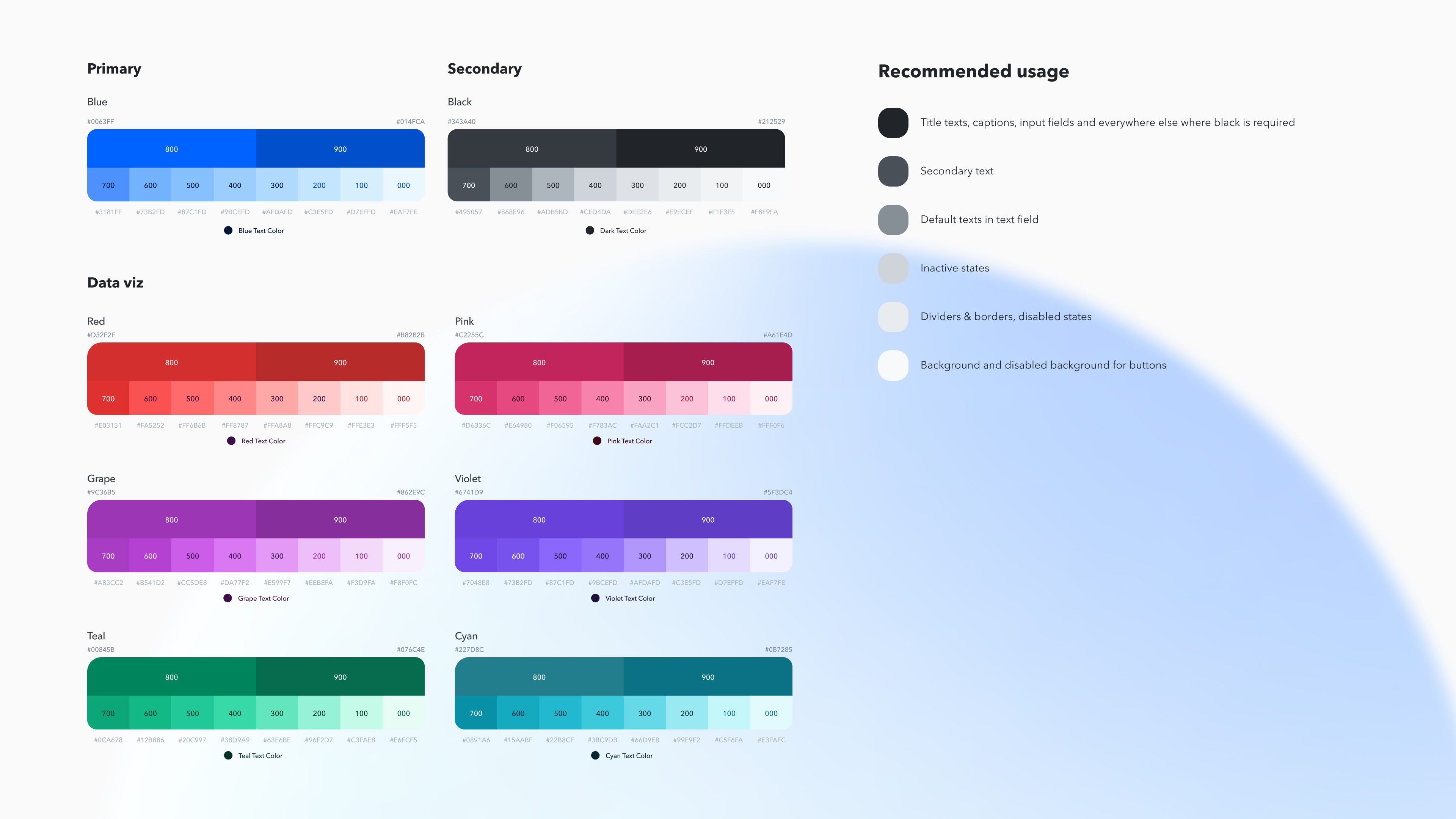
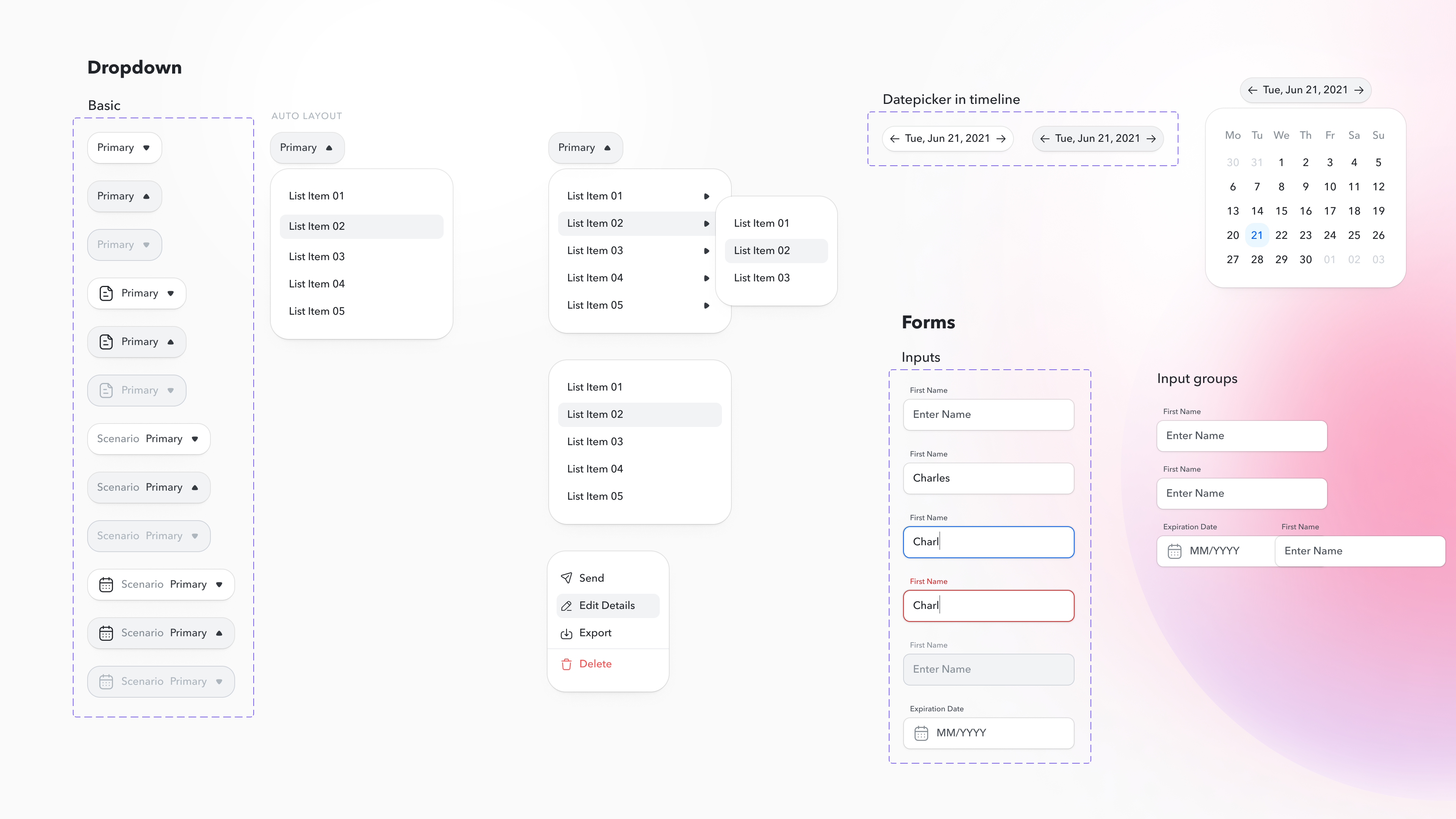
The final delivery would also include a foundational visual design system, delivered in Figma, consisting of principles, global styles, components, icons, and much more.
Impact
The new design received glowing feedback from current customers, and provides guidance to the product team. It also performs better in sales demos, allowing sales teams to inspire and engage potential customers.
